The Psychology Behind
High-Converting
Business Websites
A high-converting website is not one that looks impressive - it is one that reduces the psychological resistance between a visitor arriving and taking action. Eight principles determine this: the 50-millisecond first impression that determines whether a visitor stays or leaves before reading a word, visual hierarchy that guides the eye to the right information in the right sequence, social proof that reduces the perceived risk of contacting you, reduced cognitive load that makes the decision simple rather than complicated, CTA psychology that matches the contact method to how Indian buyers actually prefer to reach businesses, price anchoring that frames your value before the visitor forms their own judgment, friction removal that makes every step toward conversion require less effort than the step before it, and post-enquiry psychology that keeps the visitor confident they made the right decision after they contact you. Most Chennai business websites violate at least four of these principles - not by accident, but because they were built to impress designers rather than to convert visitors.
What This Guide Covers
- Why most business websites fail to convert: The foundational difference between design-first and psychology-first websites
- Principle 1 - The 50ms first impression: What visitors decide in half a second and how to win that decision
- Principle 2 - Visual hierarchy and scan patterns: Where visitors actually look and how to place content accordingly
- Principle 3 - Social proof and Indian trust signals: What Indian visitors need to see before they trust a Chennai business
- Principle 4 - Cognitive load and Hick's Law: Why more information usually produces fewer enquiries
- Principle 5 - CTA psychology and channel matching: Why a WhatsApp button converts more than a contact form for Indian businesses
- Principle 6 - Price anchoring and value framing: How to present your pricing so visitors feel they are getting good value
- Principle 7 - Friction removal: Every unnecessary step between arriving and contacting costs you enquiries
- Principle 8 - Post-enquiry psychology: What happens after the form is submitted determines whether the lead becomes a client
- The conversion audit checklist: How to assess your current website against every principle
Why Most Business Websites Generate Traffic Without Generating Enquiries
There is a consistent pattern in Chennai business websites that receive respectable traffic but generate almost no enquiries. The websites look professionally designed - clean layouts, good photography, well-written service descriptions. But visitors arrive, browse briefly, and leave without contacting the business. The gap between traffic and conversion is not a marketing problem. It is a psychology problem. The website was built to communicate information rather than to guide a decision.
A professionally built website development company in Chennai understands that visitors do not arrive on your website to read it. They arrive with a question they want answered: can I trust this business to solve my specific problem? Everything on the page either answers that question and moves them toward contacting you, or fails to answer it and allows them to leave. Visual design serves this goal - it does not replace it. The businesses whose websites consistently generate enquiries understand this distinction. The ones who keep rebuilding their websites and wondering why the new version still does not convert do not.
In our experience building and running advertising on websites for Chennai businesses, the single most common conversion problem is a homepage that spends the first three screens telling visitors about the company's history, awards, and values - rather than answering the visitor's primary question: "Can this business specifically help me with my specific problem?" Every second a visitor spends looking for relevance is a second they are considering pressing the back button.
Principle 1: The 50-Millisecond First Impression - Winning Before the Page Even Loads
Research from Carleton University found that visitors form a visual impression of a website in approximately 50 milliseconds - 0.05 seconds. This impression is almost entirely pre-cognitive: it happens before the visitor reads a single word of content. The judgement being made is not "is this business good at what they do?" It is "does this website signal that the business behind it is professional, credible, and worth my time?" A positive 50ms impression does not guarantee a conversion. A negative one guarantees a bounce.
For Indian mobile users - who make up over 80% of Chennai website traffic - this first impression forms under specific constraints: a 390-pixel wide screen, loading on a 4G connection, often with ambient distractions. The elements that form a positive first impression on mobile are different from desktop: the headline must be readable without zooming, the page must not visually shift during loading (Cumulative Layout Shift), the visual hierarchy must be immediately clear on a small screen, and at least one conversion action must be visible without scrolling.
What creates a positive 50ms first impression for Indian mobile visitors:
- Visual consistency: A coherent colour scheme, consistent typography, and professional-quality imagery signal that someone invested in the presentation - which signals they invest in their work quality too
- Immediate relevance: A headline that names the visitor's problem or the visitor's business type within the first line of text visible on mobile - "Website development for Chennai businesses" is more immediately relevant than "We help businesses grow"
- No layout shift: A page that visually jumps, loads in pieces, or has elements popping in as it loads signals technical unreliability - which transfers to business reliability in the visitor's unconscious assessment
- Appropriate visual density: Too much text packed above the fold on mobile creates a cognitive overwhelm signal. Too little creates a credibility gap. The right density is: one clear headline, one supporting sentence, one visible CTA
Principle 2: Visual Hierarchy and Scan Patterns - Where Visitors Actually Look
Eye-tracking research from the Nielsen Norman Group establishes a consistent finding: visitors do not read web pages. They scan them using predictable visual patterns. On text-heavy pages, the eye follows an F-pattern: strong attention to the top horizontal band, moderate attention to a second horizontal scan further down, then vertical scanning of the left edge. On visually-led pages, a Z-pattern is more common: top-left to top-right, diagonal to bottom-left, bottom-left to bottom-right. Understanding which pattern your page triggers determines where your highest-value content and CTAs must be placed.
For Indian mobile users specifically, the scan pattern is more linear - scrolling top to bottom - because the narrow screen eliminates the horizontal scanning component of desktop F-pattern reading. This means the first few lines of each visual block carry disproportionate weight. A heading that does not communicate its value in the first three words will not be read further on mobile.
How to apply scan pattern psychology to a Chennai business website:
- Place your primary value proposition in the top-left or top-centre of every screen: This is where the eye lands first on both F-pattern and Z-pattern pages. Generic taglines waste this prime attention real estate
- Put CTAs in high-attention zones: End of the F-pattern top bar (top-right on desktop), after the first paragraph of each section, and at the point where visitors have received enough information to make a decision
- Make headings do the conversion work: A visitor who only reads headings should be able to understand exactly what you do, who you serve, and why you are the right choice. Most Chennai business websites have headings that communicate nothing ("Our Services," "About Us") to scanners who never read the paragraph beneath
- Left-justify the most important content: On F-pattern pages, the left side is more consistently read than the right. Social proof, testimonials, and trust signals placed on the right side of the page are frequently never seen
Principle 3: Social Proof and Indian Trust Signals - What Chennai Visitors Need to See
Social proof is the psychological principle that people look to others' behaviour to guide their own decisions under uncertainty. On a website, social proof reduces the perceived risk of contacting or buying from a business you have never used before. The formats and types of social proof that work for Indian audiences have specific characteristics that differ from Western markets - and most generic conversion guides miss these entirely.
Trust signals that carry the most weight for Indian visitors in 2026:
- Specific client outcomes over generic testimonials: "BYB Traction's website redesign generated 23 new admissions in the first month" converts better than "Great team, highly recommend." Indian buyers are sceptical of generic praise but respond to specific, verifiable results. The more specific the number, the more credible the claim.
- Physical address with recognisable landmarks: Indian consumers have a higher need for physical location credibility than Western equivalents. "4th Floor, Rashmi Towers, Nungambakkam" signals permanence and accountability in a way that a virtual address never does. Mentioning a recognisable landmark ("near Nungambakkam Railway Station") increases local credibility further.
- Years in business and client count: "5+ years, 200+ projects" signals survival and experience in a market where many web agencies disappear after 1 to 2 years. This is a stronger trust signal in India than in markets with more stable business environments.
- Client logos from recognisable local businesses: A logo from a well-known Chennai business on your client list transfers credibility more directly than a logo from an internationally known company that Indian visitors may not connect with personally.
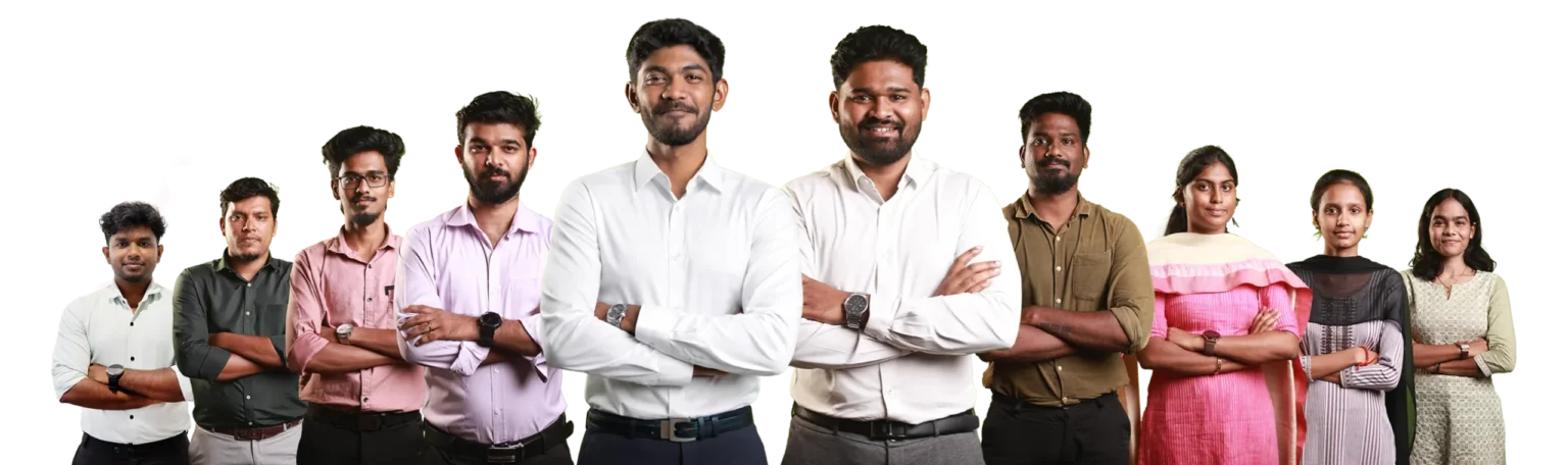
- Team photos and the owner's face: Indian businesses with personal brand visibility - where the owner or team is visible on the website - convert at higher rates than faceless corporate-looking websites. The "personal guarantee" implicit in seeing a person's face is a significant trust amplifier in relationship-based Indian market dynamics.
- Response time signals: "We reply within 2 hours on WhatsApp" as a visible promise reduces enquiry hesitation because it removes the fear of submitting a form and never hearing back. This is particularly relevant in India where contact form abandonment is high due to past experiences of no-response from businesses.
Principle 4: Cognitive Load and Hick's Law - Why More Options Produce Fewer Enquiries
Hick's Law is a well-established principle in UX psychology: the more options a person faces, the longer it takes them to make a decision, and the more likely they are to make no decision at all. On websites, this manifests as decision paralysis - visitors who face too many service categories, too many navigation options, too many CTAs on the same screen, or too much information to process before they can decide to contact you.
The cognitive load principle extends beyond menu choices. Every element on a web page consumes a portion of the visitor's mental bandwidth. A page with 12 distinct service blocks, 5 navigation items, a chat popup, a cookie consent banner, social media icons, and a testimonial carousel is asking the visitor to process 20+ competing stimuli before they can focus on the single action you want them to take. By the time they have processed the page, their decision-making energy is depleted - and they leave without converting.
Cognitive load reduction for Chennai business websites:
- One primary CTA per screen: Each visible section of your page should direct visitors toward one clear action. Two equally prominent CTAs (like "Call Us" and "WhatsApp Us" and "Fill Form") compete with each other and reduce the probability of any one being clicked
- Limit service categories to 5 or fewer in navigation: Beyond 5 top-level navigation items, visitors start to feel the cognitive cost of scanning the menu. Group related services under category names rather than listing every individual service as a navigation item
- Progressive disclosure: Present the minimum information needed for a visitor to make a contact decision on the main page. Put detailed specifications, process descriptions, and exhaustive FAQs on secondary pages that interested visitors choose to navigate to
- White space as a cognitive tool: Empty space around important elements - headlines, CTAs, trust signals - directs attention and reduces cognitive processing load. A page that uses white space effectively communicates confidence. A cramped, information-dense page communicates anxiety
The counterintuitive reality of cognitive load reduction: businesses that remove three services from their website homepage and present only their most profitable and most requested services consistently see more enquiries - not fewer - because the clearer focus allows visitors to make a faster decision about relevance.
Principle 5: CTA Psychology and Channel Matching - Why WhatsApp Beats Contact Forms in India
The Call to Action on a website is not just a button - it is a psychological permission structure. The visitor is asking: "what is the minimum commitment I need to make to get the information I want?" A contact form with 8 fields asking for name, company, phone, email, service needed, timeline, budget, and message is asking for a high-commitment action from a visitor who does not yet trust you enough to invest that effort. A one-tap WhatsApp link asks for almost nothing - the visitor sends a WhatsApp message in 15 seconds and feels in control of the interaction.
The India-specific CTA hierarchy by conversion rate (high to low):
- 1. WhatsApp click-to-chat: The lowest-friction conversion action for Indian mobile users. The visitor already has WhatsApp open 15 times per day. Tapping a button to start a conversation requires no more effort than messaging a friend. For Chennai service businesses, a visible WhatsApp CTA in the mobile header produces 3 to 5 times more enquiries than an equivalent contact form.
- 2. Tap-to-call button: A phone number formatted as a tappable link on mobile - not just displayed as text - captures visitors who prefer voice conversations. In India, phone enquiries have a significantly higher conversion rate to clients than form enquiries for B2B services.
- 3. Short contact form (3 fields maximum): Name, phone number, and message. Every additional field reduces completion rate by approximately 11% per field. A form asking for 8 pieces of information gets approximately 11% of the completions of a 3-field form, holding all other variables constant.
- 4. Long enquiry form: Appropriate for businesses where detailed requirement capture is necessary before a meaningful conversation can happen - engineering projects, large construction contracts, enterprise software. For most service businesses, this form type is a conversion killer.
CTA text psychology: The words on a CTA button determine click rate as much as its placement. "Contact Us" is a business-centric phrase describing what the visitor must do. "Get a Free Quote" is a visitor-centric phrase describing what the visitor receives. "WhatsApp Us Now" adds immediacy. "Book a Free 30-Minute Consultation" sets expectations about what happens after the click. Rewriting a generic "Submit" button to "Get My Free Consultation" typically increases form completion rates by 15 to 35%.
Principle 6: Price Anchoring and Value Framing - Presenting Pricing So Visitors See Value
Price anchoring is a cognitive bias in which the first number a visitor encounters sets the reference point against which all subsequent numbers are judged. A website that presents a Rs 1,50,000 premium plan before a Rs 44,999 growth plan makes the growth plan feel affordable. The same Rs 44,999 plan presented alone, without an anchor, triggers a more effortful "is this worth Rs 44,999?" evaluation. The number has not changed. The psychological context has.
Price framing principles for Indian business websites:
- Present the highest-priced option first: The premium option anchors the visitor's reference point. When they then see the mid-tier option, it feels like a deal relative to the anchor they just processed - even if they always intended to buy the mid-tier option
- Highlight the middle option as "Most Popular": The "compromise effect" in consumer psychology shows that people avoid extremes and are drawn to the middle option. Labelling the middle tier as Most Popular or Best Value amplifies this tendency
- Frame pricing in terms of outcomes, not features: "Rs 44,999 for a custom-designed website that generates 10 to 15 new enquiries per month" triggers a different calculation than "Rs 44,999 for a 10-page website with SEO setup." The first framing asks "is 10 to 15 enquiries per month worth Rs 44,999?" The second asks "is a website worth Rs 44,999?" The former is much easier to answer yes to.
- ROI framing for Indian B2B businesses: Indian business buyers respond strongly to ROI calculations. "If even one new client from this website pays for the entire investment" is a powerful frame for service businesses with high client values. Showing the calculation explicitly on the pricing section reduces hesitation for analytically-minded buyers.
- EMI framing for higher-value purchases: For products or services priced above Rs 25,000, showing monthly equivalent cost ("equivalent to Rs 4,166 per month over 12 months") reduces the psychological weight of the lump sum, particularly for Indian SME buyers managing cash flow
Principle 7: Friction Removal - Every Unnecessary Step Costs You Enquiries
In conversion psychology, friction is anything that increases the perceived effort of taking the next step toward your desired action. Friction accumulates: a visitor might tolerate one extra step, two extra steps, even three - but at some threshold, the accumulated friction exceeds their motivation and they leave. The businesses that consistently generate the most enquiries per visitor are not necessarily the ones with the most compelling offers. They are the ones with the least friction between the visitor's arrival and their action.
The most common friction points on Chennai business websites:
- Contact information buried in the footer: A phone number and WhatsApp link that requires scrolling past 5 sections to reach is not a contact option - it is an obstacle. Phone number and WhatsApp in the mobile header reduce the effort of contacting to zero additional scroll
- Contact form requiring email address creation: Some Chennai businesses use contact forms tied to CRM systems that require the visitor to verify their email address before the submission is processed. This is a fatal friction point - most visitors will not verify an email to make an enquiry
- No portfolio or case studies visible without navigation: Visitors who want to see your work before contacting you should not need to navigate to a portfolio page. Showing 3 to 4 case study thumbnails or outcomes on the homepage reduces the friction of evaluating your capability
- Slow page load creating decision reversal: A visitor who has mentally decided to contact you but then waits 6 seconds for the contact page to load has time to reconsider. Fast load time on contact pages specifically is a conversion-critical performance requirement
- Generic CTA text that does not set expectations: "Contact Us" leaves the visitor unsure of what happens after they click. "Book a Free 30-Minute Strategy Call" tells them exactly what to expect, removing the uncertainty friction that prevents clicks
Principle 8: Post-Enquiry Psychology - What Happens After the Form Submission
Most conversion psychology guides treat the form submission as the endpoint - the moment of conversion. For Indian service businesses, form submission is the beginning of the conversion, not its completion. The period between a visitor submitting an enquiry and receiving a response is psychologically active: the visitor is simultaneously hopeful and doubtful, wondering whether they will receive a response, whether the business is professional, and whether they have made the right decision. This period is where leads are won or lost before a single conversation happens.
Post-enquiry psychology in practice:
- The thank-you page is a trust-building opportunity: Most Chennai business websites display a generic "Thank you for contacting us" message after form submission. A high-converting thank-you page sets response time expectations ("We will WhatsApp you within 2 hours"), shows additional social proof, and suggests the visitor's next logical step
- Response time determines lead quality: Research on B2B lead response shows that the probability of converting a lead drops by 400% if the first contact is made more than 5 hours after the enquiry. Indian buyers who have submitted an enquiry to multiple businesses simultaneously - which is common - will engage most with whichever business responds first. A WhatsApp response within 30 minutes from a real person, not a bot, has a dramatically higher conversion rate than an email response 24 hours later.
- Autoresponder psychology: An immediate automated WhatsApp message or email after form submission - even one that says "We received your enquiry and will respond personally within 2 hours" - dramatically reduces the anxiety of the post-submission period. The visitor now knows the enquiry was received, which removes the uncertainty that causes them to re-enquire or move on to a competitor
- The follow-up sequence for unresponsive leads: Many Indian B2B enquiries come from buyers who are genuinely interested but were distracted before responding to your initial follow-up. A structured 3-touch follow-up (immediate WhatsApp, 24-hour call, 72-hour email with a specific next step) recovers 30 to 50% of initially unresponsive leads
The Conversion Psychology Audit: How Your Chennai Website Scores on Each Principle
| Principle | What to Check | Pass Signal | Fail Signal |
|---|---|---|---|
| 50ms First Impression | Show homepage on phone to a stranger for 5 seconds | They can name what the business does | They see a logo and a generic tagline |
| Visual Hierarchy | Read only the H2/H3 headings - do they tell a conversion story? | Headings answer "why contact us" | Headings are generic labels like "Our Services" |
| Social Proof | Count specific, named, outcome-based testimonials | 3+ specific results with client names or types | Generic star ratings or no testimonials |
| Cognitive Load | Count top-level navigation items and CTAs on homepage | Under 5 navigation items, 1 primary CTA per section | 7+ navigation items, multiple competing CTAs |
| CTA and Channel | Is WhatsApp prominently visible on mobile without scrolling? | WhatsApp visible in header or above fold on phone | WhatsApp buried in footer or absent entirely |
| Price Anchoring | Is pricing published with a most popular indication? | Transparent pricing with middle option highlighted | No pricing, or single price with no anchor |
| Friction Removal | Time how long it takes to reach contact from homepage on mobile | Under 10 seconds, under 3 taps | Requires scrolling to footer or multiple page navigations |
| Post-Enquiry | Submit a test enquiry - what happens immediately after? | Specific thank-you page + automated response within minutes | Generic "thank you" message, no follow-up |
How BYB Traction Applies Conversion Psychology to Every Website We Build
As a digital marketing agency in Chennai that runs Google Ads and Meta Ads on the websites we build, every conversion psychology decision we make is evaluated against actual data - not design preference. A CTA button that looks better in design reviews but reduces WhatsApp clicks gets changed. A homepage layout that earns praise from the business owner but generates fewer enquiries than the previous version gets rebuilt. We have the attribution data to make these decisions with confidence because we see the full funnel from website visit to paid campaign conversion.
For businesses that want to understand how their current website scores on conversion psychology before committing to a rebuild, we offer a free conversion audit that evaluates all 8 principles above with specific, actionable recommendations for each. Combined with our SEO services in Chennai, conversion psychology optimisation typically doubles the return from every additional visitor your SEO brings to the site. Our Meta Ads services in Chennai also benefit directly from conversion-optimised landing pages - the same psychological principles that improve organic conversion rates improve paid advertising cost per lead.
Conversion-focused design built in from day one
- Clear above-fold value proposition on mobile
- WhatsApp CTA in header (native, no slow plugin)
- 3-field contact form with response-time promise
- Trust signals section with client proof
- SEO setup + Search Console submission
- 15 days post-launch support (email)
Custom design with conversion structure and SEO
- All 8 conversion psychology principles applied
- Visual hierarchy planned before design begins
- Price anchoring and social proof structure
- Post-enquiry thank-you page with trust build
- Full SEO setup + 30 days support
- 1 month SEO from our Growth Plan
Advanced CRO with custom functionality
- Full conversion psychology audit before build
- Custom functionality (booking, membership)
- eCommerce conversion flow optimisation
- Post-enquiry automation setup
- 60 days support (email, WhatsApp + calls)
- 1 month SEO from our Premium Plan
Not sure how your current website scores on these 8 principles? BYB Traction offers a free audit that evaluates your website against every principle above and gives you a prioritised list of changes that will improve conversion rate - before you invest in a rebuild. Request your free audit here.
Conclusion: Design for the Decision, Not the Designer
A high-converting business website is not the most visually impressive one in your industry. It is the one that makes the fastest, lowest-friction path between a visitor arriving and a visitor contacting you. Every principle in this guide - from the 50ms first impression to post-enquiry psychology - serves that single commercial goal. When visual design supports these principles, it accelerates conversion. When visual design ignores them, even the most award-worthy website sits generating traffic while the business owner wonders why enquiries are not coming.
The businesses in Chennai that consistently grow through their websites are not the ones with the biggest design budgets. They are the ones whose websites were built with a clear understanding of how Indian buyers make decisions - what builds their trust, what reduces their hesitation, what makes the action of contacting feel natural and low-risk rather than effortful and uncertain. That understanding is the psychology behind every website we build.
4th Floor, 4A, Rashmi Towers, Nungambakkam, Chennai 600034 · +91-9600448666 · contact@bybtraction.com
Frequently Asked Questions
A high-converting business website reduces the psychological resistance between a visitor arriving and taking action. The key elements are: a clear value proposition visible within 5 seconds of arriving, visual hierarchy that guides the eye to relevant information in the right sequence, social proof that builds trust before the visitor decides to contact you, a reduced number of choices and CTAs so visitors do not experience decision paralysis, a CTA channel that matches how Indian buyers prefer to communicate (WhatsApp first for most Chennai businesses), transparent pricing that anchors value perception, and minimum friction between deciding to contact and making contact. Most importantly, the page must answer the visitor's primary question - can I trust this business to solve my specific problem - before it attempts to sell anything.
Traffic without conversions is almost always a psychology problem, not a traffic problem. The most common causes for Chennai business websites are: the homepage communicates what the business does rather than why the visitor should care, there is no clear trust evidence visible without scrolling (testimonials, client logos, specific results), the primary CTA requires more effort than the visitor's motivation level supports (8-field contact form instead of a WhatsApp button), the cognitive load of the page is too high (too many navigation options, too many services, too many CTAs competing for attention), or the page load time exceeds 3 seconds on mobile causing visitor abandonment before engagement. Solving any one of these issues typically improves conversion rate. Solving all of them can multiply it.
Social proof for Indian business websites works through specificity and credibility markers that differ from Western markets. Generic five-star testimonials have low credibility with Indian visitors who are aware they can be fabricated. Specific outcome-based proof - how many admissions, what revenue increase, what response rate improvement - carries significantly more weight. Physical address with a recognisable landmark, years in business, and visible team photos build a layer of accountability trust that is particularly important in India where business relationships are often personal rather than transactional. Client logos from recognisable local businesses transfer more credibility than internationally known brands that visitors may not personally relate to.
For most Chennai service businesses, a visible WhatsApp click-to-chat button in the mobile header is the highest-converting CTA. Indian mobile users interact with WhatsApp daily and starting a conversation requires the same effort as messaging a contact. Tap-to-call is the second highest converter for businesses where phone consultations are the primary sales channel. A short 3-field contact form (name, phone, message) converts significantly better than forms requiring 6 or more fields. The CTA text should describe what the visitor receives rather than what they must do - 'Get a Free Quote' converts better than 'Contact Us', and 'Book a Free 30-Minute Consultation' converts better than 'Submit Enquiry'.
Cognitive load is the amount of mental processing a visitor must do to understand a page and decide what to do next. Hick's Law states that more choices produce slower decisions and more abandonment. On business websites, high cognitive load comes from too many navigation items, too many competing CTAs, too much text above the fold, too many service categories, and too many visual elements all demanding attention simultaneously. Reducing cognitive load - by simplifying navigation, limiting visible services to your most important offerings, and having one clear CTA per page section - consistently improves conversion rates. The counterintuitive finding is that websites that show fewer services often generate more enquiries, because the clearer focus allows visitors to make faster relevance decisions.
Price anchoring uses a higher-priced option to make the intended purchase option feel more affordable. When a website shows a premium plan first, followed by a growth plan, the visitor's reference point for price has already been set by the premium anchor. The growth plan then feels like a relative bargain compared to that anchor, even if the visitor always intended to buy the growth plan. Highlighting the middle option as Most Popular triggers the compromise effect - people avoid extremes and are drawn to options perceived as balanced. Framing pricing in terms of business outcomes rather than deliverables also improves conversion: 'Rs 44,999 for a website that generates 10-15 monthly enquiries' triggers a different calculation than 'Rs 44,999 for a 10-page website'.
The thank-you page after form submission is significantly underused by most Chennai businesses. Most show a generic 'Thank you for contacting us' and nothing more. A psychologically optimised thank-you page sets clear response time expectations to reduce post-submission anxiety, shows additional social proof to reinforce the visitor's decision, and suggests the next step the visitor can take while waiting. Additionally, the speed of response after an enquiry directly determines whether the lead converts to a client - Indian buyers who submit multiple enquiries simultaneously engage most deeply with the business that responds first. A WhatsApp response within 30 minutes from a real person, not a bot, has a dramatically higher conversion rate than an email response 24 hours later.
Eye-tracking research from the Nielsen Norman Group found that visitors scan text-heavy web pages in an F-pattern: strong horizontal attention across the top, moderate attention across a second horizontal band further down, then vertical scanning of the left edge. The practical implication is that content placed on the right side of desktop pages, in the lower-right quadrant, and in later paragraphs receives significantly less attention than content at the top-left and in opening sentences. For business websites, this means: value proposition and trust signals belong at the top of every section, CTAs should appear at the end of the top horizontal band and after the first paragraph, and testimonials placed on the right side of service sections may never be seen. For Indian mobile users scanning vertically, the first line of every content block carries disproportionate weight.